Glassmorphism is the frosted-glass look: a translucent panel that blurs whatever is behind it, edged with a thin light border and lifted by a soft shadow. It takes only a few lines of CSS, but the result depends heavily on what sits behind the panel and on how readable the text on top stays. This guide walks through the effect, the settings in our CSS Glassmorphism Generator with the exact CSS each produces, and the problems that make glass cards look good in a demo and poor in production.
The four parts of the effect
A glass card is four ordinary CSS properties working together:
- A translucent background, such as
rgba(255, 255, 255, 0.2). Without transparency there is nothing to see through. backdrop-filter: blur(), which blurs everything painted behind the element. This is the frosted part.- A light border, usually a 1px line in semi-transparent white, which catches the "edge" of the glass.
- A soft shadow, which separates the panel from the background and gives the impression it floats.
Note the difference from the plain filter property: filter: blur() blurs the element itself and its content, while backdrop-filter blurs only what is behind it and leaves the card's own text sharp.
Using the generator
- Pick a Background scene: Sunset, Ocean (the default), Candy, Forest or Monochrome gradient. This only changes the preview, not the CSS you copy.
- Set the sliders: Blur (0 to 40px), Tint Opacity (0 to 100%), Border Radius (0 to 48px), Border Opacity (0 to 100%) and Shadow Intensity (0 to 80%). Tint Color is a colour picker.
- Check the glass card in Live Preview.
- Click Copy CSS and paste it into the rule for your card.
With the default settings (Ocean scene, 12px blur, white tint at 20%, 16px radius, 30% border, 37% shadow) the tool outputs exactly this:
background: rgba(255, 255, 255, 0.2);
backdrop-filter: blur(12px);
-webkit-backdrop-filter: blur(12px);
border-radius: 16px;
border: 1px solid rgba(255, 255, 255, 0.3);
box-shadow: 0 8px 32px 0 rgba(31, 38, 135, 0.37);
A darker variant, with a Sunset scene, tint colour #0f172a at 25%, 16px blur, 20px radius and a 20% border, produces:
background: rgba(15, 23, 42, 0.25);
backdrop-filter: blur(16px);
-webkit-backdrop-filter: blur(16px);
border-radius: 20px;
border: 1px solid rgba(255, 255, 255, 0.2);
box-shadow: 0 8px 32px 0 rgba(31, 38, 135, 0.37);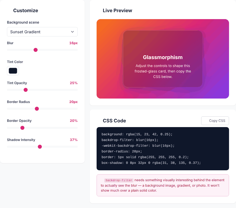
The tool writes backdrop-filter twice, once with the -webkit- prefix. Both lines always carry the same value. Older Safari versions needed the prefix; current browsers accept the unprefixed form, and keeping both is harmless.
What each control does
- Blur sets the radius of the backdrop blur. Around 8 to 16px reads as frosted glass; at 0 the line becomes
blur(0px)and the card is simply a translucent rectangle; at 40 the background turns to a soft colour wash. - Tint Color and Tint Opacity become the
rgba()background. A white tint brightens the glass and suits darker backgrounds; a dark tint calms bright backgrounds and usually helps white text. At 0% opacity the background isrgba(255, 255, 255, 0), so you get blur only. - Border Radius rounds the corners from 0 to 48px.
- Border Opacity controls the 1px edge. The border colour is always white; only its opacity changes.
- Shadow Intensity is the opacity of a fixed blue-violet shadow,
rgba(31, 38, 135, x). At 0 the output still contains the shadow line, with an opacity of0.00, so it is invisible rather than removed.
Things the generator does not output: the card's width, padding, text colour, or the background behind it. You write those yourself. The border colour and shadow colour cannot be changed in the tool; edit them in the copied CSS if you want, for example, a neutral grey shadow.
The effect needs something behind it
The most common disappointment: the glass card looks like a plain grey box. The blur only means something when the background has detail to blur: a photo, a gradient with several colours, shapes or text. Over a flat colour, there is nothing to smear and the effect vanishes. The preview scenes in the tool are smooth gradients, so the blur there is subtle. To see what blur really does, here is the default CSS applied over a striped background in a separate test page, at blur(0px) and at the default blur(12px):
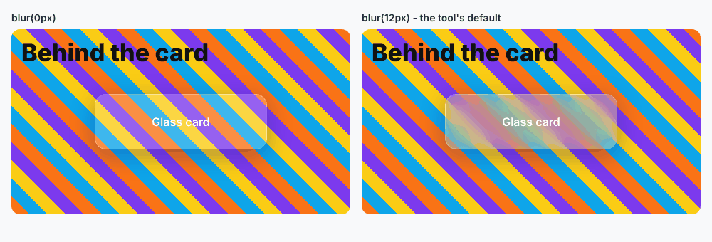
The picture also shows a second problem: white text is hard to read over the left card, because the stripes run straight through it. Even with the blur, the right card sits on bright yellow and orange regions, where white text has low contrast.
Shape your own glass card
Open the Glassmorphism GeneratorKeeping text readable
This is where glass designs most often fail accessibility checks. The text sits on a background whose colour changes across the card, so contrast depends on what is behind it. Practical measures:
- Raise the tint opacity for cards with a lot of text. A 20% tint is decorative; 40 to 60% is often needed for body copy.
- Prefer a dark tint with white text, or a light tint with dark text, and test it against the lightest and darkest parts of your real background rather than the tool's preview gradient.
- Add a subtle text shadow or use a heavier font weight for headings placed over busy areas.
- Run a contrast check on the worst-case region of the background. Aim for the WCAG AA ratio of 4.5:1 for normal text.
- Keep long paragraphs off glass. Use glass for short labels, cards and navigation, and a solid surface for reading.
Browser support and fallbacks
backdrop-filter is supported in current versions of Chrome, Edge, Safari and Firefox. Very old browsers ignore it, in which case the visitor sees only the translucent tint, which can make text unreadable on a busy background. A safe pattern is to make the default solid enough and enhance it where supported:
.card { background: rgba(15, 23, 42, 0.85); }

@supports (backdrop-filter: blur(1px)) or (-webkit-backdrop-filter: blur(1px)) {
  .card {
    background: rgba(15, 23, 42, 0.25);
    backdrop-filter: blur(16px);
    -webkit-backdrop-filter: blur(16px);
  }
}
This is a pattern, not tool output: the generator gives you only the enhanced declarations.
Performance and layout notes
- Blur is real work for the browser. A few glass cards are fine. Many large blurred elements, or glass panels that move or animate over a video, can make scrolling heavy on low-end phones. Keep the blur radius modest and the glass areas small.
- Stacking. The card must overlap the content you want blurred, so it needs to be positioned above it (for example inside the same container, with the background as a sibling or the container's background).
- Pairing with other effects. A glass card looks good with a subtle inner highlight made with
box-shadow: inset; try the Box Shadow Generator. For the opposite style, soft raised surfaces, see the Neumorphism Generator.
Privacy
The generator only builds text from your slider values. The tool's code makes no network requests except the optional feedback form; we watched the network while moving every control and saw nothing sent. The page loads its styling and icons from a public CDN when it opens.
Quick answers
Why do I see no blur on my card? Check that something detailed is behind it and that the card has a semi-transparent (not solid) background. A card over a plain colour looks unblurred even when the property works.
Does the Background scene setting end up in my CSS? No, it only changes the preview.
Why are there two backdrop-filter lines? One is the standard property and the other carries the -webkit- prefix for older Safari. The tool always writes the same value in both.
Can I use it over a photo? Yes, and a photo is often the best background. Put the photo on the container as a background image and place the glass card inside it.
Shape your own glass card
Open the Glassmorphism Generator