The mouse pointer is a small piece of feedback that users read without thinking. A hand over a link says "click"; an I-beam says "you can select this text"; a circle with a slash says "not right now". CSS lets you set that pointer per element with the cursor property. Our CSS Cursor Selector & Generator has two parts: a library that shows every built-in value so you can try each one under your own mouse, and a builder that produces a custom SVG cursor. This guide covers both, with the limits you should know before shipping a custom pointer.
The built-in library
The Built-in Library tab shows a grid of 36 cards, one per standard cursor keyword. Hover a card and your real pointer changes to that cursor, which is the point of the tool: you cannot judge a cursor from its name. Click a card and the tool copies a ready-made rule to your clipboard. For the grab card, the copied text is:
.my-element {
  cursor: grab;
}
Replace .my-element with your own selector. The card briefly turns green to confirm the copy.
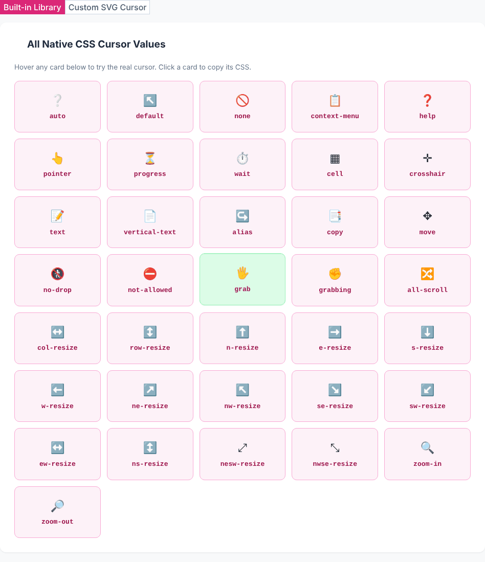
The 36 values in the grid are: auto, default, none, context-menu, help, pointer, progress, wait, cell, crosshair, text, vertical-text, alias, copy, move, no-drop, not-allowed, grab, grabbing, all-scroll, col-resize, row-resize, the eight compass resizers n-resize through sw-resize, ew-resize, ns-resize, nesw-resize, nwse-resize, zoom-in and zoom-out. That matches the standard list of keyword values for the property. The emoji on each card is only a visual label; the actual pointer shape is drawn by your operating system and differs between Windows, macOS and Linux.
Choosing the right keyword
Most pages need only a handful. A practical mapping:
pointerfor anything clickable that is not a real link or button, such as a card with a click handler. Real<a href>and<button>elements already have sensible behaviour in most browsers, so you rarely need to set it on them.not-allowedon disabled controls, so users understand why a click does nothing.no-dropis the drag-and-drop version, shown over a target that will refuse the item.grabandgrabbingfor draggable canvases, carousels and maps. Setgrabon hover andgrabbingon:active.textover editable or selectable text;vertical-textfor vertical writing modes.helpover a question-mark icon or an element that opens an explanation;context-menuwhen a right-click menu is available.progressversuswait: both show a busy indicator, butprogresssignals the app is working while still usable, andwaitmeans it is not.zoom-inandzoom-outover images that open a lightbox or toggle zoom.col-resize,row-resize,ew-resize,ns-resizeon splitter handles and table column edges. The corner values (nwse-resize,nesw-resize) suit resize handles at box corners.crosshairandcellfor precision selection, such as drawing tools and spreadsheet-like grids.nonehides the pointer completely. Use it sparingly, for example in full-screen video or a game, because a page where the pointer vanishes is disorienting.
Two more points that save time. The property is inherited, so setting cursor: pointer on a card also applies to its children unless they set their own value. And auto lets the browser choose based on context (an I-beam over text, an arrow elsewhere), which is the right default most of the time.
Building a custom SVG cursor
Switch to the Custom SVG Cursor tab to generate a pointer from an inline SVG. The controls:
- Cursor Shape: Dot, Ring, Cross, Star or Arrow.
- Color: any colour from the picker.
- Size: 16px to 64px (default 32px).
- Fallback Cursor:
pointer,auto,crosshairordefault.
Then move your mouse over the dashed box under Live Preview — Hover the Box. It uses the generated cursor for real, so what you feel in the box is what visitors get. With a ring in sky blue (#0ea5e9), 32px and a crosshair fallback, the output is:
.custom-cursor-target {
  cursor: url("data:image/svg+xml,<svg xmlns='http://www.w3.org/2000/svg' width='32' height='32'><circle cx='16' cy='16' r='13' fill='none' stroke='%230ea5e9' stroke-width='3'/></svg>") 16 16, crosshair;
}
Break that value down, because you will want to edit it:
url("data:image/svg+xml,...")is the image, embedded as text. No file hosting is needed.%23is an escaped#. A raw#in a data URI starts a fragment and cuts the image off, so the tool escapes it in the colour. If you edit the colour by hand, keep it as%23rrggbb.- The SVG uses single quotes for its attributes so the outer double quotes of
url("...")are not broken. 16 16is the hotspot: the pixel inside the image that counts as the exact click point.crosshairafter the comma is the fallback, used if the image fails to load or is rejected.
We confirmed that the generated string loads as a valid 32 by 32 image in Chromium and is accepted as the element's computed cursor.
Find the right cursor for your element
Open the Cursor GeneratorThe hotspot: a limitation to check
The hotspot decides where a click lands. A pointer is only usable if the visible "tip" and the click point agree. The tool always sets the hotspot to half the size on both axes, so 16 16 at 32px and 32 32 at 64px. That is correct for Dot, Ring, Cross and Star, which are centred shapes. It is not correct for the Arrow shape. Its tip is drawn at the top-left (the polygon starts at 2,2), but the click point is still the centre of the image, 14 pixels to the right of and 14 pixels below the tip at 32px. Visitors would aim with the tip and click somewhere else.
The fix is a manual edit. For the Arrow, change the two numbers after the data URI from the centre values to the tip, for example 2 2:
cursor: url("data:image/svg+xml,...") 2 2, pointer;Use the same approach for any shape you draw yourself: put the hotspot where the pointer's "point" is, not at the centre.
Size, fallbacks and touch screens
Size. The tool offers 16 to 64 pixels and warns that sizes above 32px may not render as a cursor in some browsers. In general, browser documentation treats 32 by 32 as the safe size and 128 by 128 as the upper limit; larger images are ignored, and some browsers hide big cursors near the edges of the window. Stay at 32px or below unless you have tested the browsers you support.
Always include a fallback. The syntax requires a generic keyword at the end of the list. If the image cannot be used for any reason, the fallback keeps the pointer visible and meaningful. Choose the fallback to match the role of the element: pointer for clickable things, crosshair for a drawing area.
Touch screens have no pointer. Phones and tablets show no cursor, so a custom cursor is invisible there. Do not use cursor shape as the only signal of interactivity; style the element visibly (colour, underline, border) as well.
Contrast. A single-colour cursor can vanish on a background of the same colour. Test the cursor over your lightest and darkest areas. A ring or a shape with a contrasting outline survives this better than a solid dot.
Restraint. A fancy pointer is a branding choice with a usability cost: it can feel laggy, may conflict with the operating system's accessibility settings (such as enlarged pointers), and breaks users' expectations of what is clickable. Consider reserving custom cursors for a specific interactive region, such as a canvas or a game, and keep standard cursors for normal page content.
Applying the CSS
Rename .custom-cursor-target to your selector and paste the rule into your stylesheet. Because the property inherits, you can put it on a container and let the children follow, then override it on specific children (for instance cursor: pointer on buttons inside a custom-cursor canvas). If you want an animated or multi-colour cursor, the data-URI approach only suits simple static shapes; use a PNG or CUR file with url(file.png) x y, fallback instead, and keep the same hotspot and fallback rules. Related UI details are covered by the CSS Button Generator and the Tooltip Generator.
Privacy
Everything is generated from your selections in the page. The tool's code makes no network requests apart from the optional feedback form; we watched network activity while switching tabs and changing settings and saw no data being sent. The page loads its stylesheet and icon fonts from a public CDN when it opens.
Quick answers
Why does my cursor not change? Check specificity (another rule may override it), check that the element is actually under the pointer, and check that a child element is not setting its own cursor.
Do I need cursor: pointer on links? Not on real links with an href. Add it to non-link elements that act like buttons.
Can I use an emoji or a PNG? A PNG works the same way as the SVG in url(). For an emoji, draw it into an SVG text element or export it as an image; keep it small and test the hotspot.
Is the copied CSS safe to paste? It is plain CSS text with no scripts. The only encoded part is the SVG image inside the url().
Find the right cursor for your element
Open the Cursor Generator