A button looks simple, but a good one is really four styles in one: how it looks at rest, when the pointer is over it, while it is being pressed, and when someone reaches it with the keyboard. The CSS Button Style Generator writes the first three for you and hands you matching HTML. This guide walks through the controls, shows what each effect really outputs, and then covers what a generator cannot decide for you: contrast, size, focus, fonts and whether you should be using a button or a link at all. We tested the generated code in separate test pages in a Chromium browser, and one finding about the tool's preview is important enough to put first.
Read this first: the Live Preview does not show your styling
The tool's Live Preview is meant to be a real button wearing the generated CSS. At the time of writing it is not. The CSS the tool produces targets the class .btn-custom, but the preview button has a different class (preview-btn-custom), so none of your colours, padding, radius or hover effects appear on it. In our test the preview stayed a plain grey browser-default button, about 83 by 30 pixels, whatever the settings (the label text does update). The code box and the HTML box are correct, and the generated code worked as expected in every test below.
So treat the CSS Code box as the real result, and check your design in a test page or on your own site: paste the CSS and HTML into a file, open it, and hover and click. The screenshots later in this guide were made that way.
The controls, step by step
- Button Text. Up to 30 characters. If you clear it, the HTML falls back to Click Me.
- Background and Text Color pickers.
- Border Radius: 0 to 50px.
- Padding (V / H): two sliders, the first for vertical (4 to 30px) and the second for horizontal (8 to 60px).
- Font Size: 10 to 28px.
- Border Width: 0 to 6px, and Border Color.
- Hover Effect: None, Darken, Lift + Shadow, Grow or Glow.
- Click Effect: None, Press Down or Shrink.
- Use Copy CSS and Copy HTML.
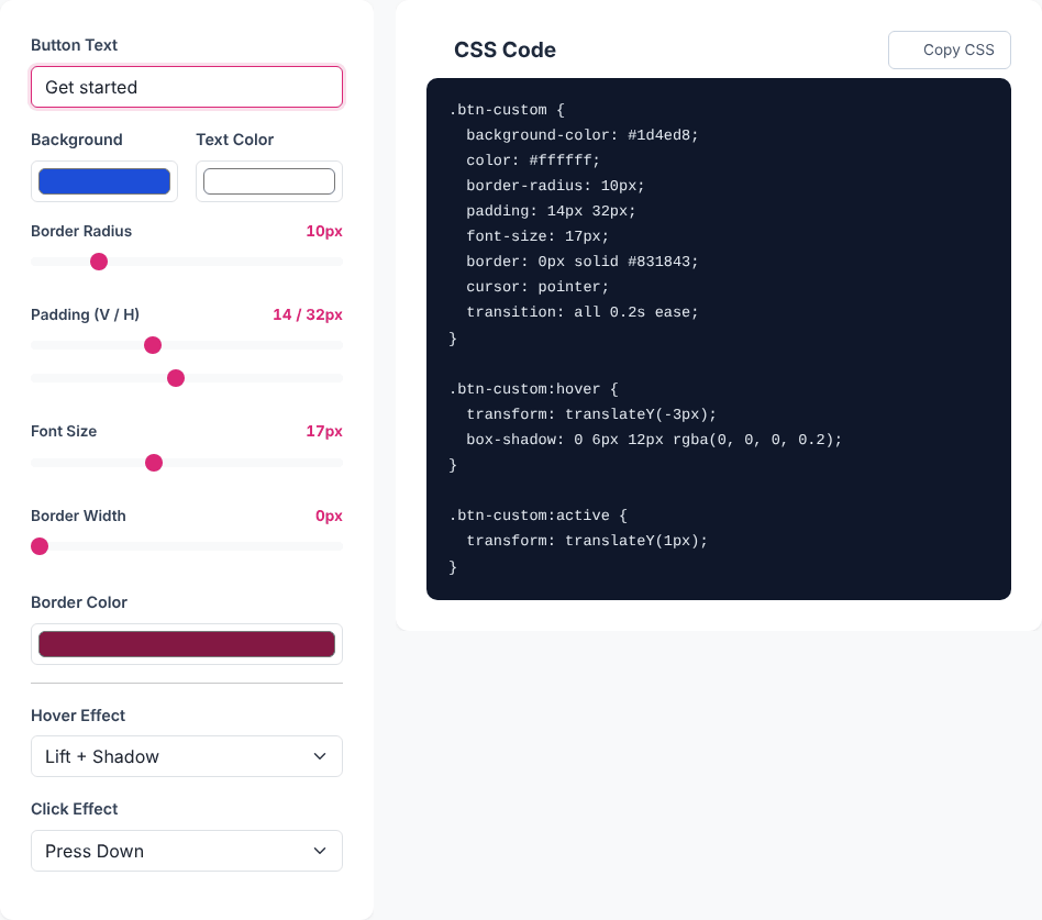
That example produces:
.btn-custom {
  background-color: #1d4ed8;
  color: #ffffff;
  border-radius: 10px;
  padding: 14px 32px;
  font-size: 17px;
  border: 0px solid #831843;
  cursor: pointer;
  transition: all 0.2s ease;
}
.btn-custom:hover {
  transform: translateY(-3px);
  box-shadow: 0 6px 12px rgba(0, 0, 0, 0.2);
}
.btn-custom:active {
  transform: translateY(1px);
}
<button class="btn-custom">Get started</button>Choosing None for an effect leaves its block out entirely rather than writing an empty one. The border line is always written, even at 0px width, which is harmless.
What each effect outputs
- Darken sets the hover background to the base colour with every colour channel multiplied by 0.85. For
#1d4ed8that is#1942b8. Two edge cases follow: black stays black (#000000darkened is still#000000, so a black button shows no hover change), and white becomes#d9d9d9. - Lift + Shadow moves the button up 3px with
translateY(-3px)and addsbox-shadow: 0 6px 12px rgba(0, 0, 0, 0.2). Our Box Shadow Generator explains tuning that shadow. - Grow scales the button to 1.05 on hover.
- Glow adds a 20px blurred shadow in the button's own background colour:
box-shadow: 0 0 20px #db2777for the default pink. - Press Down (on
:active) moves the button down 1px; Shrink scales it to 0.95.
The base rule includes transition: all 0.2s ease, so every effect animates over a fifth of a second. If you only change a few properties, you can narrow it, for example transition: background-color 0.2s ease, transform 0.2s ease, box-shadow 0.2s ease.
Hover and click effects combine, and the click wins. The :active rule comes after the :hover rule, and both set transform. We pressed the mouse while hovering and read the computed values. With Lift + Press, the hovered button sat at translateY(-3px), and while pressed it was at translateY(1px), so it moves 4px down but the lift shadow stays. With Grow + Shrink, the 1.05 scale became 0.95. With Glow + Shrink, the glow stayed while the button shrank. The pairs behave sensibly, but remember that the pressed state replaces the hover transform rather than adding to it.
Ready to style a button?
Open the Button GeneratorColour contrast: the number that matters most
The tool will let you choose any pair of colours, including ones that are hard to read. The standard measure is the WCAG contrast ratio, where 4.5 to 1 is the common minimum for normal-sized text (3 to 1 for large text). We calculated it for a few typical pairings with the standard formula:
- White on the default pink
#db2777: 4.60, only just passing. - White on blue
#1d4ed8: 6.70. - White on amber
#f59e0b: 2.15, failing. Black on the same amber: 9.78. - White on green
#22c55e: 2.28, and on emerald#10b981: 2.54, both failing. White on grey#6b7280: 4.83.
Bright "friendly" colours often fail with white text. Switch the Text Color to a very dark one (for example #111827 on #fbbf24 gives 10.63), or darken the background. Check the hover colour too: the darker hover of the default pink (#ba2165) has a ratio of 6.01, so darkening usually helps contrast, but a Glow or Lift effect does not change it at all.
Size, touch targets and spacing
The padding sliders let you go small. With the smallest settings (4px vertical, 8px horizontal, 10px font) a button measured only about 29 by 19 pixels in our test, which is hard to tap. The default (12px by 28px, 16px font, Arial) measured 117 by 42 pixels, and the blue example above (14px by 32px, 17px) is 48px tall. Accessibility guidelines set a minimum target size of 24 CSS pixels in each direction (WCAG 2.2, level AA) and recommend 44 pixels for comfortable touch (level AAA). For primary actions on mobile, keep to roughly 44px of height, and leave space between neighbouring buttons.
What the generated code leaves out
Font
The CSS sets font-size but not font-family or font-weight. A <button> does not inherit the page's font by default: in our test page with a Georgia body, the generated button rendered in Arial at weight 400. Add font-family: inherit; (and a weight such as font-weight: 600;) so the button matches your page.
Keyboard focus
Nothing in the code removes the browser's focus ring, and in our test tabbing to the button showed the default ring (outline: auto 1px). Keep it. If you want a custom one, add a :focus-visible rule with a clearly visible outline; never write outline: none without a replacement. Note also that the hover and press effects only help mouse and touch users.
Disabled and loading states
There is no :disabled style. If your button can be disabled, add something like .btn-custom:disabled { opacity: 0.5; cursor: not-allowed; transform: none; }, because otherwise the hover lift would still play on a disabled button.
Hover on touch screens
If you do not want hover effects on devices without a hovering pointer, wrap the hover rule in @media (hover: hover) { ... }.
Button or link?
The tool outputs a <button>, which is right for actions: submitting a form, opening a dialog, toggling something. If clicking should take someone to another page, a link (<a href>) is the correct element, and you can style it with the same class. It needs two extra lines: we tested the generated CSS on an anchor, and it stayed display: inline with an underline. Adding display: inline-block; text-decoration: none; restored the button look and the full 48px height.

When you paste the HTML, remember it uses the class name btn-custom and no type attribute. Inside a form, a button without a type submits the form, so add type="button" when it should not. If you need several button styles on one page, rename the class in both the CSS and HTML for each one; the tool always writes btn-custom.
Privacy and escaping
The tool runs in your browser: no requests carried our settings, and nothing is stored between sessions. One detail to be aware of with the text field: the HTML box writes your text exactly as typed. When we entered A & B <b>x</b>, the HTML output was <button class="btn-custom">A & B <b>x</b></button>, with the tags unescaped, so they would render as bold in your page. That is useful if you want an inline icon, but write & and < yourself for literal characters.
Quick answers
Can I add a gradient or an icon? Not in the tool. Edit the copied CSS (background: linear-gradient(...) replaces the background colour) or the HTML.
Why does my hover effect not show on a black button? The Darken effect multiplies the colour by 0.85, which leaves pure black unchanged. Use Lift, Grow or Glow, or choose a very dark grey.
Does it write vendor prefixes? No. The properties used (transition, transform, box-shadow) work unprefixed in current browsers.
How do I make it full width? Add width: 100% to the class, or display: block for an anchor.
Ready to style a button?
Open the Button Generator