An accordion is a list of headings where clicking one reveals the content underneath it. It is the standard pattern for FAQ sections, specification lists and settings panels, because it keeps a long page scannable. You can build one with a few lines of JavaScript, but you do not have to: plain HTML and CSS are enough. This guide explains how the markup produced by our CSS Accordion Generator works, how to configure it, what to check after pasting it into a real page, and one accessibility gap in the generated code that you should fix before shipping.
Everything below was checked in a browser, including the generated code in a standalone page with JavaScript switched off.
How a CSS-only accordion works
The generator uses what developers call the checkbox (or radio) hack. Each item is a hidden <input>, a <label> that points at it with a matching for attribute, and a content block that comes after both. Clicking the label toggles the input, and a CSS selector reacts to the input's :checked state:
.acc-input:checked ~ .acc-content {
  grid-template-rows: 1fr;
}
The ~ is the general sibling combinator, so this only works because the content block is a sibling that follows the input. That is why the generated HTML keeps input, label and content side by side inside one .acc-item wrapper.
The animation uses a grid trick instead of the older max-height workaround. The content block is a grid whose single row is 0fr when closed and 1fr when open, with transition: grid-template-rows on it. The inner element has overflow: hidden, so the collapsed row hides everything, and the row grows to the real height of the text. You never have to guess a maximum height. We sampled the preview mid-animation: with the default 0.3s duration, the content of a newly opened item measured 32px, 53px, 78px and finally 80px tall in successive samples, while the item that was closing shrank from 104px to 0.
The native <details> and <summary> elements do the same job with even less code and are keyboard-accessible out of the box, so they are worth considering for simple cases. The input-and-label approach earns its place when you want a styled header, the grid-based height animation, or an exclusive "only one open at a time" group that you control from CSS.
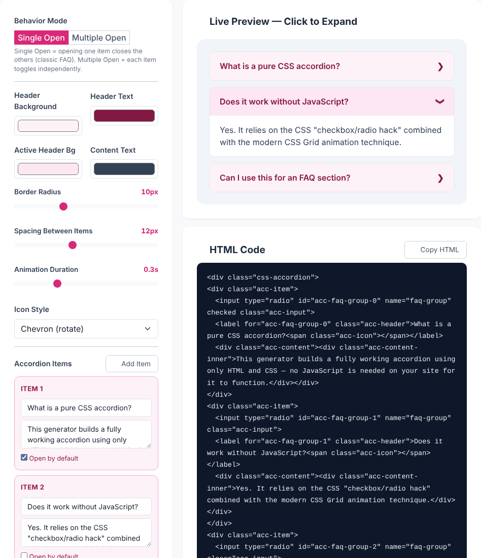
Using the generator, step by step
- Choose a Behavior Mode. Single Open uses radio inputs that share one
name, so opening an item closes the others. Multiple Open uses independent checkboxes with noname. - Set the colours. Four pickers: Header Background, Header Text, Active Header Bg (the header colour while an item is open) and Content Text.
- Adjust the shape and timing. Border Radius runs from 0 to 30px, Spacing Between Items from 0 to 30px, and Animation Duration from 0.1s to 0.8s.
- Pick an Icon Style: Chevron (rotate), Plus / Minus or None.
- Edit the items. Each card under Accordion Items has a title field, an answer field and an Open by default checkbox. Add Item appends a new one, and the trash button removes one (it disappears when only one item is left).
- Test it in the Live Preview. It is the real generated markup injected into the page, so clicking the headers exercises the actual code.
- Copy the code. Copy HTML and Copy CSS are separate buttons, so paste the HTML where the accordion belongs and the CSS into your stylesheet.
The code it produces
With the default settings the HTML for the first item is:
<div class="css-accordion">
<div class="acc-item">
  <input type="radio" id="acc-faq-group-0" name="faq-group" checked class="acc-input">
  <label for="acc-faq-group-0" class="acc-header">What is this tool for?<span class="acc-icon"></span></label>
  <div class="acc-content"><div class="acc-content-inner">...answer...</div></div>
</div>
...
A few details are worth understanding. In Single Open mode, every input carries name="faq-group", which is the only thing that makes the browser close the others when a new one opens. In Multiple Open mode the name attribute is left out. Ids follow the pattern acc-faq-group-0, acc-faq-group-1 and so on, and each label's for matches its input's id. The item marked Open by default gets the checked attribute. If you switch to Single Open while several items are marked, the tool keeps only the first.
The CSS is a single block of about 40 lines. It styles .css-accordion (a flex column using your spacing as the gap), .acc-item (a 1px #e2e8f0 border and your radius), the header, and the grid-based content area. Two values have no control in the tool: the content background is fixed at #ffffff and the border colour at #e2e8f0. If your page has a dark theme, edit those two lines after pasting. The Plus / Minus style swaps the symbol using a ::before pseudo-element, and the chevron rotates 90 degrees when open.
Pasting it into a real page
The generated code works with JavaScript disabled, which we confirmed by loading it into a page with scripting turned off and clicking a header. Three things are worth checking when you drop it into your own site.
Duplicate ids when you use it twice
The id prefix and the radio group name are always faq-group. Paste two generated accordions on one page and both use acc-faq-group-0, acc-faq-group-1 and so on. We tested exactly that: clicking the third header of the second accordion opened the third item of the first one, because a label's for finds the first element with that id. In Single Open mode the two groups would also share one radio name and interfere with each other. The fix is a find-and-replace on the pasted HTML: change faq-group to something unique such as faq-shipping in the second copy. After renaming, the two accordions worked independently.
Class name collisions
Class names such as .acc-header and .acc-content are generic. If your stylesheet or a CSS framework already uses them, rename them in both the HTML and the CSS. Because the CSS rules are not scoped, the same applies in reverse: .acc-input { display: none; } will hide any element in your site that uses that class.
Long and rich content
Whatever you type into an item's title or answer field is inserted into the HTML as written, not escaped. That is useful: we entered <ul><li>One</li><li>Two</li></ul> and a link in an answer, and both rendered correctly, as did <b> in a title. It also means a stray < or an unclosed tag will break the markup, so write real HTML there (use < for a literal less-than sign) and test with your longest real answer, not the placeholder text.
Ready to build your own accordion?
Open the CSS Accordion GeneratorKeyboard access: the gap to fix
This is the most important caveat. The generated CSS hides the inputs with display: none. An element with display: none cannot receive keyboard focus, so a keyboard user pressing Tab never lands on an accordion header. In our test, tabbing from a button placed just before the preview went straight to the next controls on the page and skipped all three headers. Mouse and touch users are fine; keyboard and many assistive-technology users cannot operate the accordion at all.
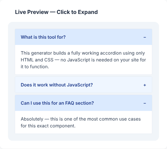
The fix is to hide the input visually while keeping it focusable, and to show a focus ring on the header. Replace the generated .acc-input rule with this:
.acc-item { position: relative; }
.acc-input {
  position: absolute;
  opacity: 0;
  pointer-events: none;
}
.acc-input:focus-visible + .acc-header {
  outline: 2px solid #1d4ed8;
  outline-offset: -2px;
}
We tested this patch in a standalone page. Tab moved focus onto the first input, the header showed an outline, the Down Arrow key moved to the next item and opened it (radio groups follow the arrow-key behaviour built into browsers), and in checkbox mode Space toggles the focused item. Two limits remain. A radio-based accordion cannot be closed again by clicking its open item: radio buttons cannot be unchecked, and we confirmed that clicking the open item twice left it open. If users need to collapse everything, choose Multiple Open. And because this is a styled input rather than a button, screen readers announce it as a radio button or checkbox, not an expandable section. For public content where that matters, the native <details> element is the better semantic choice.
Writing a better FAQ section
The generator solves the markup; the content is still yours. A few habits make FAQ accordions work better:
- Write headers as real questions in the words a visitor would use, and put the most common ones first.
- Keep each answer to one question. If an answer needs sub-headings, it probably belongs on its own page.
- Choose Single Open for short FAQs that people read one at a time, and Multiple Open when visitors might compare answers side by side, such as a spec list.
- Open the first item by default only if it is the one most visitors want. Otherwise leave everything collapsed.
- Collapsed content is still in the page's HTML, so it is available to anyone who reads the source. We did not test how any particular search engine treats hidden text, so do not rely on an accordion for search visibility.
Privacy and browser support
The tool runs in your browser. We watched network traffic while editing items, changing options and switching modes, and saw no requests carrying your content; the only request the page can send is the feedback form on the Contact tab. Your item text is not stored anywhere between visits, so copy your code before you close the tab.
The animation relies on transitioning grid-template-rows, which is a relatively recent browser capability. In a browser that does not support it, the accordion should still open and close, just without the smooth height change, but we only tested in a current Chromium-based browser, so check your target browsers if you support old versions.
Quick answers
Does the generated accordion need JavaScript? No. The generated HTML and CSS work on their own, and we confirmed it with scripting disabled. Only the generator page itself uses JavaScript.
Can I change the content background or border colour? Not in the tool. Edit background: #ffffff in .acc-content and the border colour in .acc-item in the copied CSS.
Why can't I close the open item in Single Open mode? Radio inputs cannot be unchecked by clicking them again. Use Multiple Open if collapsing is required.
Ready to build your own accordion?
Open the CSS Accordion Generator